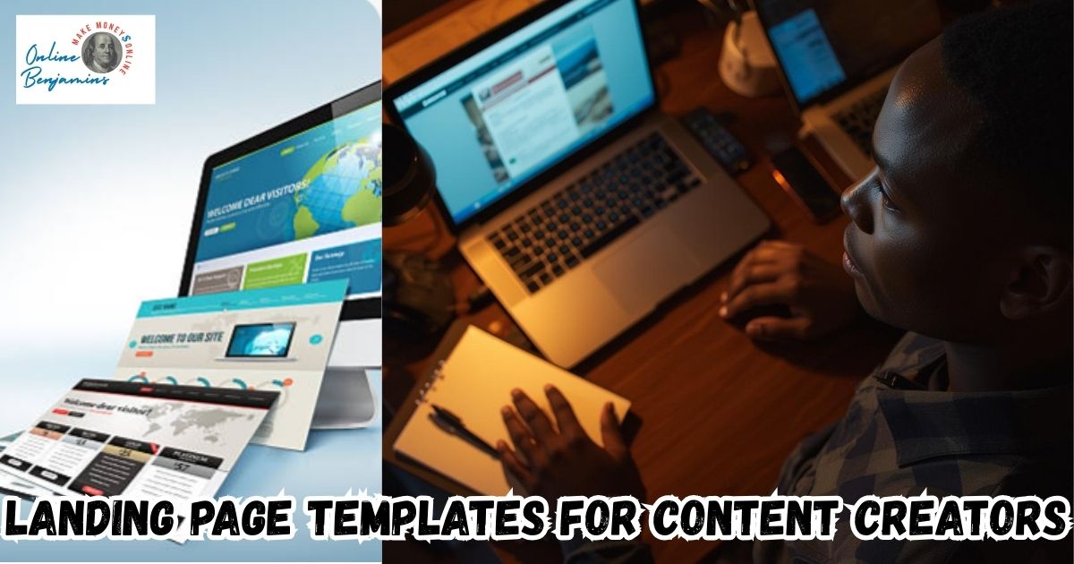
Finding a landing page that actually gets clicks and signups feels impossible sometimes, especially with so many choices out there for creators like me. Templates that are built to convert give a real boost if you want to sell digital products, grow your newsletter, or book more clients. I’m sharing the highest-conversion landing page templates, along with what makes them work, to help you pick one that matches your creative goals.
QUICK LOOK: – Essentials of High-Converting Landing Page Templates
- Immediate Value: The headline and subheading explain what the offer is and who it’s for right away. People don’t have time to dig, so the main benefit hits first thing.
- Strong Hero Visual: I always include either a product image, a video, or a clear graphic right at the top. The hero section sets the tone and should answer the “why should I care?” question in five seconds.
- Social Proof: Reviews, testimonials, or user counts add credibility. Even a screenshot of positive feedback helps.
- Focused Call to Action: One button, one message. The button stands out and uses action-driven text like “Get My Guide” instead of just “Submit.”
- Mobile Optimized: Over half of my traffic comes from phones, so everything must be easy to read and use on smaller screens.
Why Conversion-Focused Templates Make the Difference
I know from experience that even if your offer is great, a cluttered or unfocused landing page can make people leave before they take action. The best templates use minimalist design, social proof, and a single call to action to guide visitors toward a clear goal. The right layout does more than look nice. It helps visitors decide in just a few seconds if your offer is right for them.
Whether you’re growing an email list, selling an online course, or launching a membership, small design choices add up. I’ve seen higher conversions with templates that remove distractions, highlight user testimonials, and adapt easily for mobile users. Those simple tweaks make a surprising difference for creators at any stage.
Top Template Types for Higher Conversions
Not every landing page is built the same. After trying a lot of different types, here are the main templates I rely on (and often see used by leading creators):
- Longform Sales Pages: These pages walk visitors through a story from pain points to benefits, then offer a solution with plenty of testimonials. I use this for bigger launches or premium courses. The extra detail helps answer common questions and reduces buying hesitations.
- Two-stepa Two-step Instead
- Videocentric Landing Pages: Putting an explainer or introduction video front and center builds trust quickly. People stick around longer to watch a real person explain an offer, which means more conversions. I use this style for webinar registrations or digital product launches.
- Simple Squeeze Pages: For growing a newsletter or giving away a free download, the best pages have only a headline, a short value statement, and a form. Minimal design keeps the focus on signing up. I often switch to this layout for lead magnets because distractions are removed.
- Product Listicle Pages: Laying out benefits or testimonials in a clear list helps visitors scan and “get” the offer fast. I use these when I want to highlight customer stories or unique features.
Frequently Asked Questions
Many creators ask about landing pages. I’ve answered some frequent ones from my own experience:
What’s the easiest way to improve my landing page conversion rate?
The quickest win is making the headline clear and adding a testimonial or user count. Visitors often decide in a blink if your page feels trustworthy.
Should I use a template or hire a designer?
For most solo creators or small teams, starting with a proven template saves time and delivers results. As your brand grows, you can always switch to custom design if needed.
What’s the ideal number of form fields?
I stick to only what’s absolutely needed. For emails or free downloads, just a single field works best. For checkout pages, I keep fields minimal to make buying faster.

Essential Elements in High-Converting Templates
Some landing pages just work better than others. Here are the features I always look for or add when I’m building a page I want people to act on:
- Immediate Value: The headline and subheading explain what the offer is and who it’s for right away. People don’t have time to dig, so the main benefit hits first thing.
- Strong Hero Visual: I always include either a product image, a video, or a clear graphic right at the top. The hero section sets the tone and should answer the “why should I care?” question in five seconds.
- Social Proof: Reviews, testimonials, or user counts add credibility. Even a screenshot of positive feedback helps.
- Focused Call to Action: One button, one message. The button stands out and uses action-driven text like “Get My Guide” instead of just “Submit.”
- Mobile Optimized: Over half of my traffic comes from phones, so everything must be easy to read and use on smaller screens.
Checking these boxes means more visitors turn into leads or customers, which keeps my projects growing.
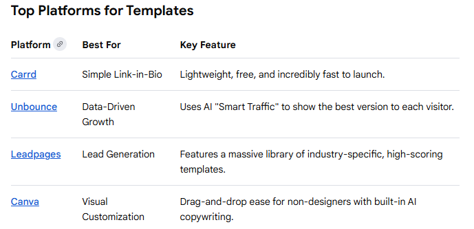
Best Platforms for High-Converting Creator Templates
Plenty of tools offer templates, but some work better for creators than others. I’ve had the best luck with these platforms when I want to launch fast without hiring a designer:
- Leadpages: Known for templates that grow email lists or book sales calls. Their drag-and-drop builder makes customizing layouts simple.
- SamCart: Great for sales or checkout pages, with a focus on selling digital products and upsells. I use this when my main goal is sales, not just collecting leads.
- Framer: Offers modern designs, especially for creators in tech, AI, or SaaS. These templates look clean and feel fresh.
- Bubble: If I’m building a web app or plugin, Bubble gives more flexibility for interactive or dynamic landing pages.
- Dribbble: This is where I find inspiration for current design trends before I build or buy a template.
Each tool has its specialty. I pick the one that fits my project’s core goal, whether that’s collecting emails, selling, or promoting a launch.
Matching Templates to Creator Niches
The best landing page varies by what you’re promoting. Here’s how I decide which style fits different creative projects:
- Course Creators & Coaches: Detailed sales pages or webinar signup templates work well. I use ones that let me break down what’s inside the program and stack lots of testimonials.
- Digital Product Sellers: For ebooks or online tools, single product sales pages with streamlined checkout help buyers act fast. I look for templates from Canva (usually bundles of layouts) or Shopify when I’m working in ecommerce.
- Newsletter Writers & Lead Magnets: Single field squeeze pages that push a strong reason to sign up. ConvertKit (now called Kit) has some of the easiest ones to pick up and use.
- Freelancers & Agencies: Portfolio templates that emphasize results and include a clear “Book a Call” or “Get a Quote” button. I’ve had good experiences with Carrd or with Creatifyr’s templates for service businesses.
Picking a template with layouts that match your offer and audience makes building a high-conversion page a lot easier.
What Actually Boosts Conversions
Every time I tweak a landing page, I notice a few elements that make a difference. Here’s what I always make sure to include:
- A Clear Hook: The headline promises a specific result. For example, “Grow Your List by 1,000 Subscribers in 30 Days.” Vague statements won’t grab attention.
- Specific Social Proof: Stats like “Trusted by 5,000+ creators” or honest feedback turn skepticism into trust. I find numbers work especially well if backed by photos or screenshots.
- Mobile Readiness: Most of my conversions come from people on their phones, so I test every page on mobile before launching. Buttons should feel clickable, and forms should be simple.
- One Goal, One CTA: I avoid extra links or navigation menus that pull visitors away from the main action.
Making these changes doesn’t take much time,e but really pushes conversion rates up. I keep every page focused and proof-driven for the best results.
Handling Common Landing Page Challenges
Working with a variety of landing page designs, I’ve run into some common problems and learned a few fixes that help:
- Overwhelming Visitors: Too many features or distractions can make people bounce. I trim content to just the essentials, keeping sections short and punchy.
- Generic Messaging: Pages that sound like everyone else’s don’t connect well. Making the headline and promise really specific to my audience works better.
- Ignoring Mobile: Sloppy mobile formatting ruins good desktop designs. I use preview functions during editing to check the mobile version every time.
- Not Testing: Even small tweaks to button color or headline wording can change results, so I regularly swap things out and check the data.
It’s easy to skip the basics, but staying focused on simplicity and one action keeps conversions strong, even as design trends switch up.
Real-World Examples of High-Converting Templates
Watching other creators succeed can give me great ideas for my own pages. Some of the highest converting templates I’ve spotted are:
- Webinar Signups: Often feature a personal video, bold timer, and testimonials. I’ve seen conversion rates above 20% with just these three elements.
- Checklist Lead Magnets: Short headline, three benefits, and a single opt-in field. On Leadpages and ConvertKit, these pages often get 30% or higher opt-in rates.
- Product Launch Pages: Longform with a hero section, list of features, comparison table, and buyer reviews. SamCart’s sales templates enable one-click checkout, helping creators turn browsers into buyers fast.
Testing similar pages for my projects, I see real lifts in signups and sales, especially when I combine strong visuals and focused CTAs. For example, adding a customer review photo right under the headline often increases trust on the spot.
Another trick I use is contrasting button colors to make the CTA stand out even more, drawing the eye instantly to the action you want visitors to take. If your audience is international, consider using simple language and currencies for more accessibility, improving conversion across borders.
Additionally, offering bonuses or limited-time discounts can add urgency, nudging visitors who might be on the fence. Embedding a countdown timer has pushed up conversion rates for me significantly during launch periods. Including a short FAQ section toward the end also addresses common objections, making it easier for people to move forward. I always track changes with analytics tools, so I know what’s truly making an impact and keep iterating on what works best.
Check Out Our Most Recent Articles:
- Scaling Content Production Without Increasing Costs

- Balancing Content Quality And Posting Frequency
- Is The Dreaded Google “Shadow Ban” Real?

- Low Website Traffic Affecting My Google AdSense Earnings
- Best Strategies To Overcome Content Creator Burnout

- Is Amazon FBA Dead?

Wishing You Much Success With Your Landing Pages,

- onlinebenjamins.com
- thebeachangler.com
- thesinnerinthemirror.com
- diyoutdoorsmen.com
- Facebook: Online Benjamins
- Twitter: @onlinebenjamin1
- Instagram: dotcomdinero
- YouTube: Online Benjamins
Rex
P.S. If you have any questions or are unsure of anything, I am here, and I promise I will get back to you on all of your questions and comments. Just leave them below in the comment section. Follow me on Twitter: @onlinebenjamin1, Instagram: dotcomdinero, and Facebook: Online Benjamins.

Hi,
Thanks for stopping by and congratulations for taking the first steps to building your own online business. I’ve been in business both offline and online since 1997. I would consider it an honor to help you build your business. Father of 3, life long outdoorsman with an education in Genetics and Economics. This site is about cutting through the BS and finding the real opportunities in the online world. I look forward to working with you.